We were interested to see the paper State of the Art of Sports Data Visualization by Charles Perin et al., published last year.
At After the flood, we have worked on several sports data projects. Sports data complement other means of coverage, engaging current and new audiences by visualising ideas such as passing patterns in football or the number of first-serve points won in a tennis tournament. The potential value of sports data visualisation in sports media and sponsored content is huge as a means to engage new audiences.
Our work with UEFA Champions League demonstrates this, showing how sports data can be visualised across multiple formats, making information consumable by a variety of audiences.
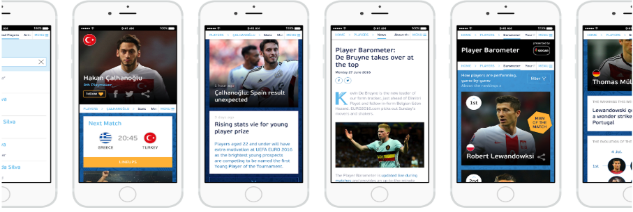
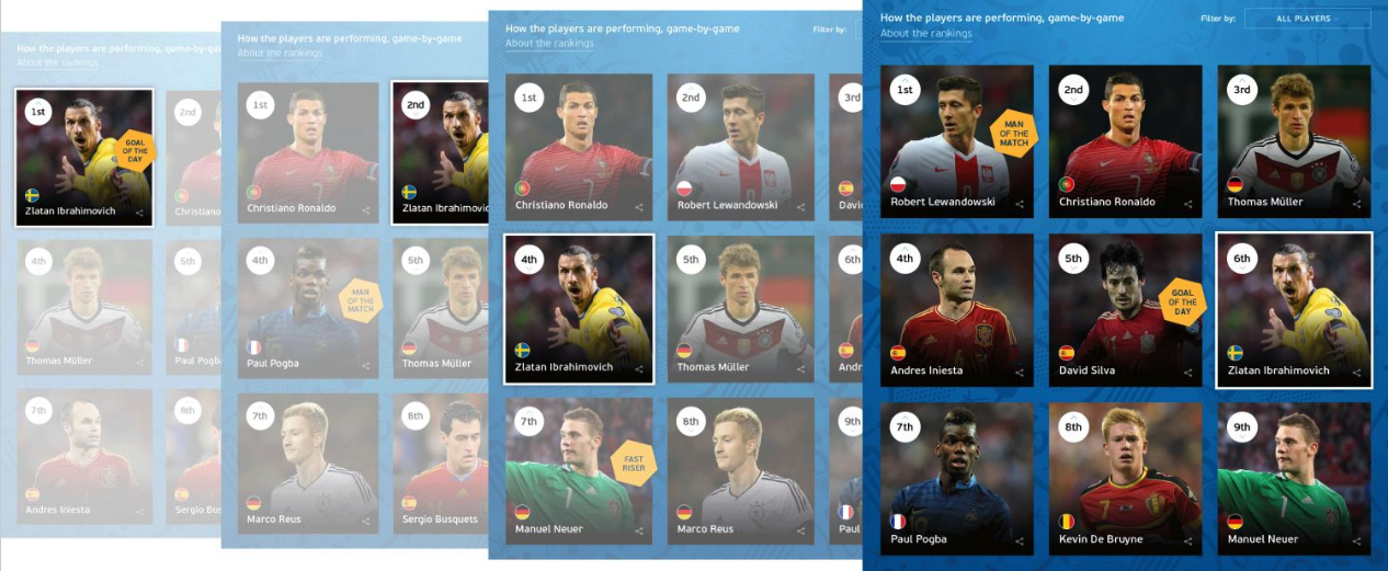
We created a Player Barometer which showcased a new type of player ranking that was used over 26 million times during the 2016 Euros and for the 2018-19 Europa League. Using a combination of ‘player cards’ and new player metadata, we eschewed more complex visualisations to create something that would work for experts and non-experts alike across a variety of devices.
Perin and colleagues’ work highlights visualisation formats similar to this. The paper is an excellent roundup of the data available and the state of the art in sports data visualisation.
From box score data which looks at “discrete in-game events” to tracking data which gathers spatiotemporal points in real-time during the course of play, to a richer perspective using “metadata”; weather conditions, physical characteristics of players, social media activity during a game and even a players’ “diet”.
“We are increasingly seeing rights holders being creative with how their data is used by a variety of partners. Data is shared with a variety of partners from broadcasters and content marketers to mass-engagement channels such as games platforms, social channels, and sponsored content. The challenge is that, as with every sector, sport is awash with data. The opportunity is that if you can engage new sports audiences in data, there is huge value in new products, content, and IP”.
Daniel Geey, Partner at Sheridans and Author of Done Deal
We would like to take this a step further and understand how sports data visualisation can be put into practice to engage a mass-market audience.
This paper is part of an ongoing journey, exploring how sports data visualisation not only seeks to engage audiences and fans but also to inform them. Players, coaches, teams and a variety of sports professionals can use sports data to co-create performance strategies. Sports data also provides a lucrative opportunity for sponsors, investment partners, and endorsement deals.
Our understanding of how organisations can grow their user base through approachable visualisation is what attracted UEFA, BBC Sport and AIG to our work. It is also why we have reviewed this article to expand the debate on the art of sports data visualization.
In a two-part series, we draw out some of the themes put forward in the paper and suggest how they can be put into practice to engage the mass market audience.
Part I looks at some of the key recommendations in formatting data visualization. Part II includes some tangible strategy recommendations on how to get there.