In this section we take a look at some new ways to present data, from rankings and relative quality to the importance of storytelling, and how they may engage new audiences based on our experience of designing for global reach.
Rankings
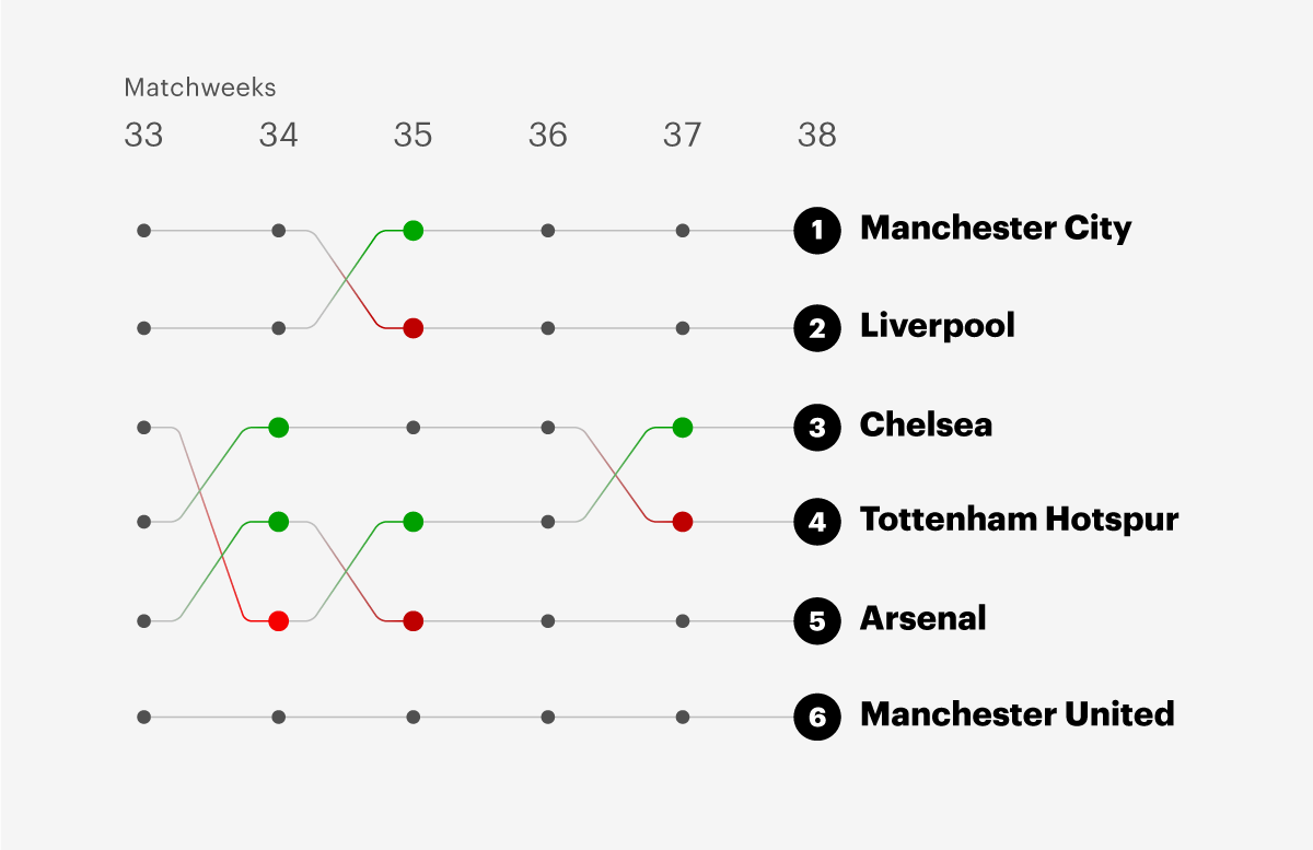
As the sketch shows, highlighting a visual chronology of change over time shows fans what to pay attention to. This provides context to the current state of affairs.
Designers could create new ways of interrogating known data that work within already understood paradigms, perhaps by using the language of spreadsheet columns. This would allow fans to gain confidence and become well versed in discussing the fluidity and patterns in positions of teams in a tournament or table.
Exposing Relative Differences
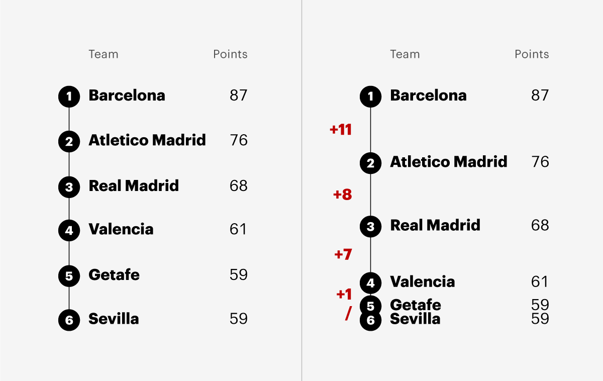
Ranking tables can mislead the reader by using equal increments between all contenders when there is often a story in the margins of victory.
Information design makes the invisible visible, accentuating the crucial differences in performance that can separate winners from losers. This visual amplification provides an engaging point or moment of drama to hook in new fans from moment-to-moment.
Using relative rather than absolute rankings is interesting because it can expose some of the invisible dimensions within sports. However relative quality requires complementary data, such as quantity or frequency.
“Our work engages the c-suite at football clubs, who often have limited experience interacting with data, so for us, it’s really important that our graphics aren’t just interesting, but are useful.”
Omar Chaudhuri, Head of Football Intelligence, 21st Club
Trajectory
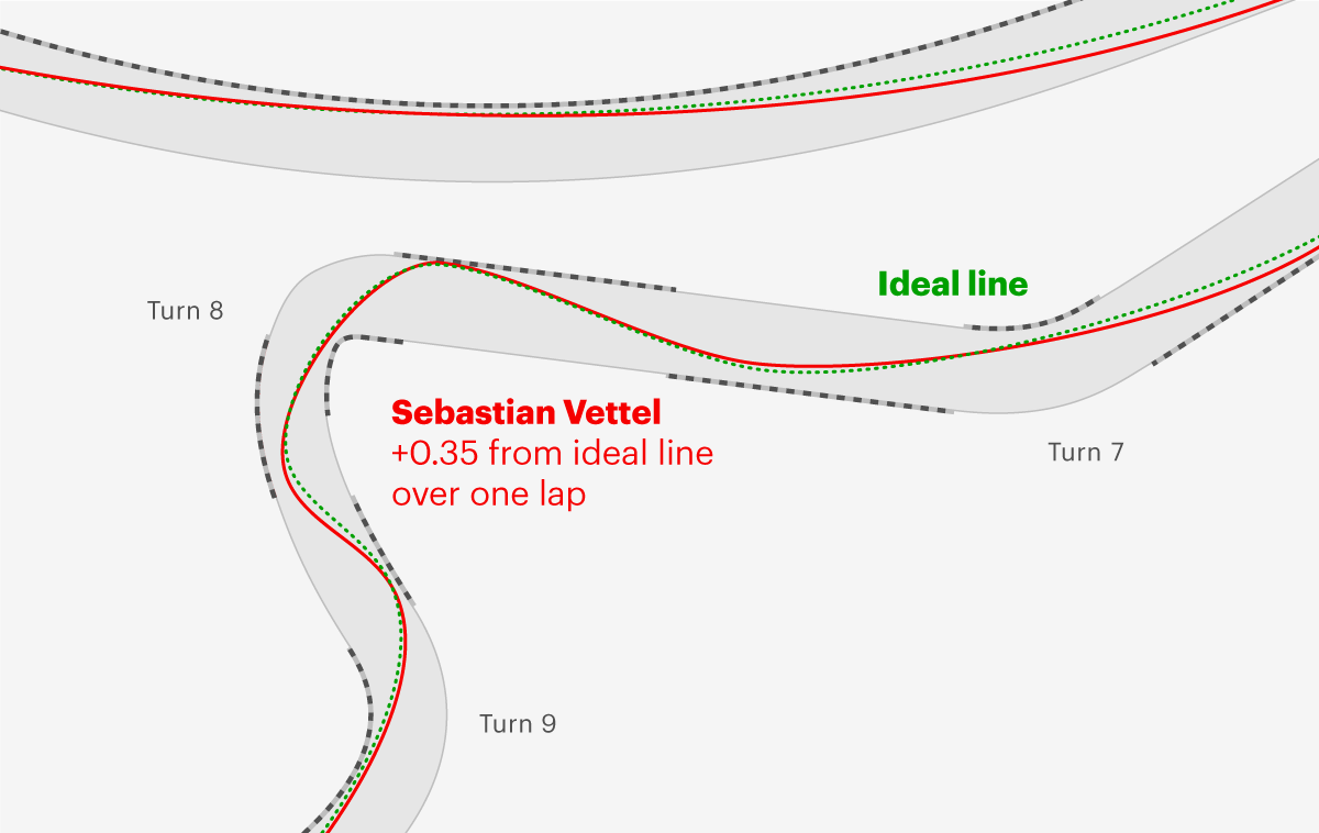
A common question for novice viewers when watching a sporting event is “was that a good or a bad move?” This can be asked in the context of a single event. Long-term engagement can be also created by placing it in the context of a season or tournament.
Trajectory visualisations show where competitors or teams are going; deconstructing where they are, how they got there, the direction they are headed and, further out in time, the possible outcomes of their playing season.
As a visualisation tool, this allows both novices and experts to understand current events in the context of how that event could have gone better or worse, and how it might affect the final standings at the end of a season.
“Simplicity is therefore really important. This is something we have learned over the years—we try and focus on one key message when delivering a graphic, rather than a collection of ideas. We need to ensure that someone can look at it and understand what the key message is inside 5 or 10 seconds.”
Omar Chaudhuri, Head of Football Intelligence, 21st Club
Stories in the season
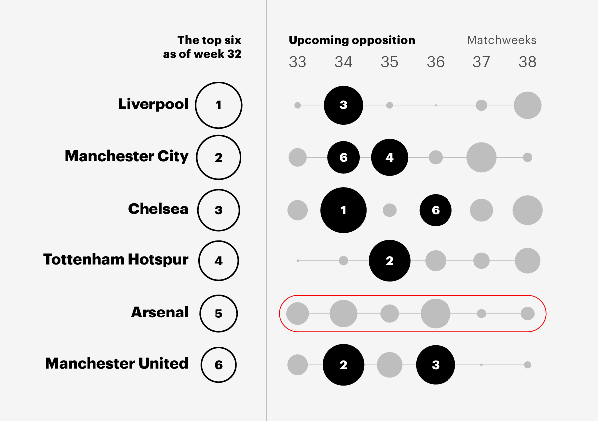
Visualising the structure and stages of the tournament is important as it shows where risks and opportunities are placed for teams and individual competitors. A dynamic tournament structure table showing checkpoints and the jeopardy of favoured entities meeting is more interesting than simple tournament dates or a calendar.
New players should be able to follow their team along with competitors that affect theirs. In this instance, good data storytelling involves looking for teams related in a tournament history, rivalry, “breakout” status or other factors that fans discuss during or after a game.
Play signature
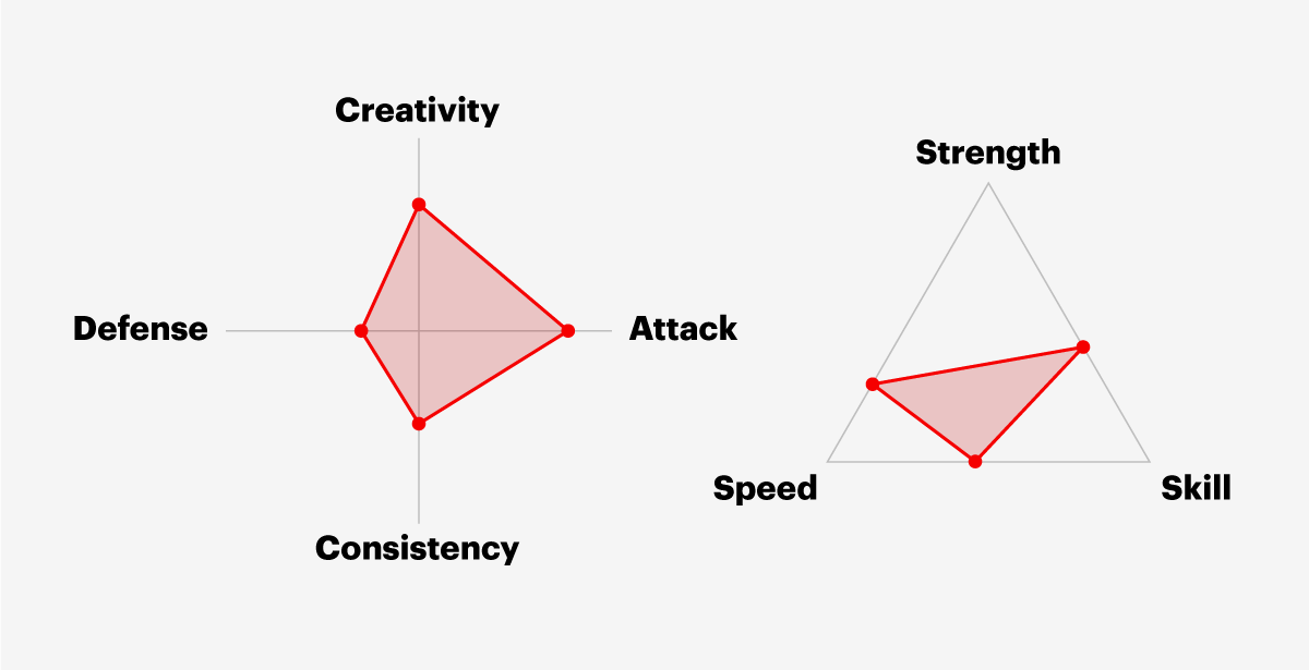
The idea that each team has a particular fingerprint or playing style that marks them different from other teams is interesting. This idea could be extended to an individual player’s style across a variety of sports. For new fans who want talking points in their own language, this data can then be converted into more qualitative ratings such as “creativity”, “attack”, or “skill”.
While our comments above reflect on ideas presented in the paper by Charles Perin et al., our section on strategy recommendations addresses what we would like to see from future research into sports data visualisation.