Ed. This text was originally published as the introduction to Cities Squared: Making Urban Data Legible.
Data provides solutions to the most pressing challenges that cities face in the 21st century. Advances in data technologies mean that city managers can capture rich data associated with transport, pollution, and social mobility. But how can we visualise this data, and tell stories with it? How can we use maps to tell these stories?
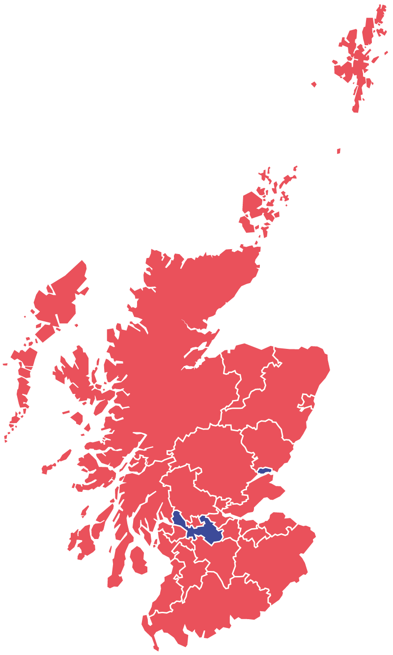
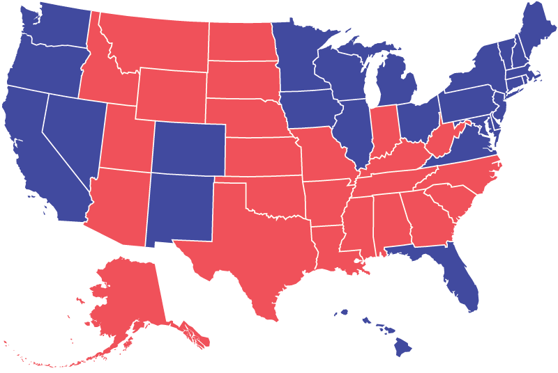
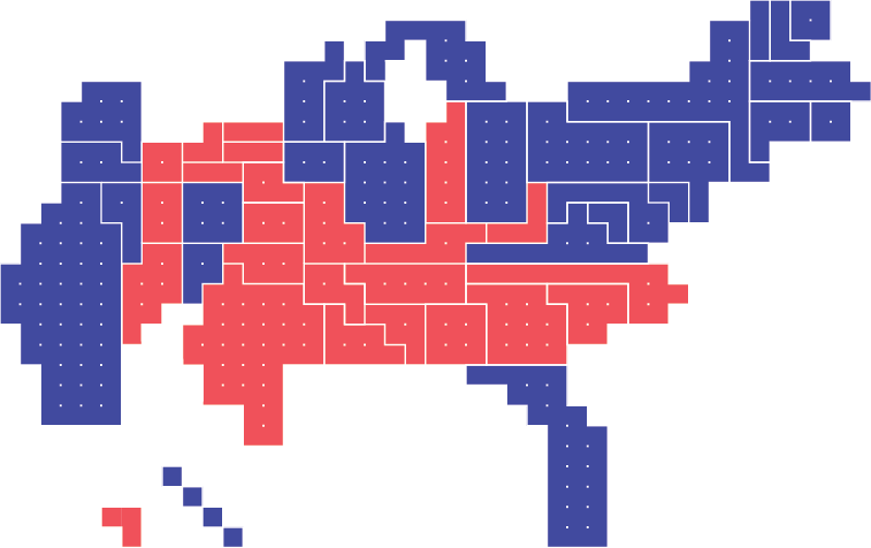
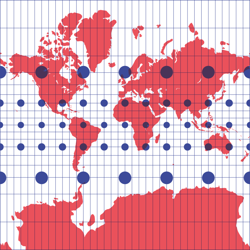
There have been advances in digital display technology for geospatial data, making it much easier to plot urban data on maps. However, most city maps still remain faithful to real-world geographic scale (or at least given the impression of doing so—all maps transform the world they represent in some way). The issue with geographical fidelity is that lay map-readers tend to conflate size with importance. For example, the public tended to misread maps associated with US elections and the Scottish independence referendum, where large but sparsely populated voting districts seem more important than smaller, but more populous districts. We sought to solve this problem by using “equal-area cartograms”—maps in which all districts are made the same size, meaning each district has the same visual weight (we will refer to these cartograms hereinafter as “square maps”). Square maps are usually only used to represent countries or continents—no one makes square maps of cities. This is partly because there wasn’t always so much data on cities, but also because reporting tends to look at larger, national or supra-national patterns. Today there is a lot more granular city-level data available. We had a hunch we could bring the square map down to the scale of the city, and revolutionise how we visualise city data.
Origins
This project was born in London, where we were trying to find ways to help the public engage with the huge amounts of data being collected on their city. Existing ways of accessing or representing this data were woefully obtuse. These experiments produced the original London Squared map. This first square city map was a static illustration that demonstrated a concept, rather than functioning fully as a live tool. As the project developed, we played with this new kind of map, exploring what else it could do. We created a simple web app for generating a data-based choropleth.¹ We created a photo collage composed of images pulled from Instagram based on location tagging. Later, we updated the web tool to make it easier for other people to create their own versions.² During this period of play, we also began to apply the concept to other cities, to see what would happen. This book is the result of those experiments.
“Rational” units
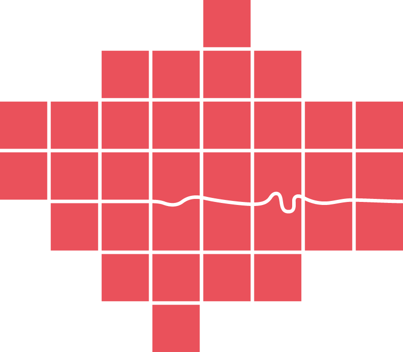
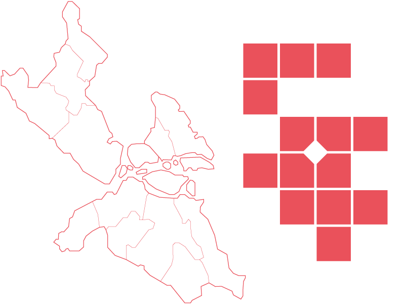
We wanted to create maps that would allow district-to-district comparison. We knew that differences in geographic size of districts tends to distract map-readers. To neutralise this problem, we chose to standardise the geographic area of each city unit (by this we refer to boroughs, wards, administrative divisions, etc.—we’ll use the generic “district” hereinafter). In the maps in this book, city units are represented by equally-sized “cells.” The choice to standardise the size of different districts really is the heart of this project.
When we make the size of districts consistent, the reader can focus more clearly on the relevant data we are seeking to communicate (like, for example, population density). They will no longer be influenced by geographic scale. Equally sized map cells also provide a useful canvas for displaying other forms of data visualisation, such as bar charts, line charts, or pie charts. Such charts sit awkwardly on traditional maps. Clearly, moving away from real world geography opens up a host of representational opportunities. It helps us to use maps to tell a wider variety of stories.
Shaping perception
Standardising the size of each city district does present challenges. Square maps can distort the physical shape of a city and the relative geographical location of districts within that city. Sometimes these distortions are too extreme—at some point, a square map can just stop looking enough like the city it is meant to represent. Sometimes districts seem to join that shouldn’t, and sometimes districts are far apart when inhabitants know full well they are adjacent. Sometimes the square map annihilates the iconic outline of a city (how would we recognise London without the famous bends of the Thames?).
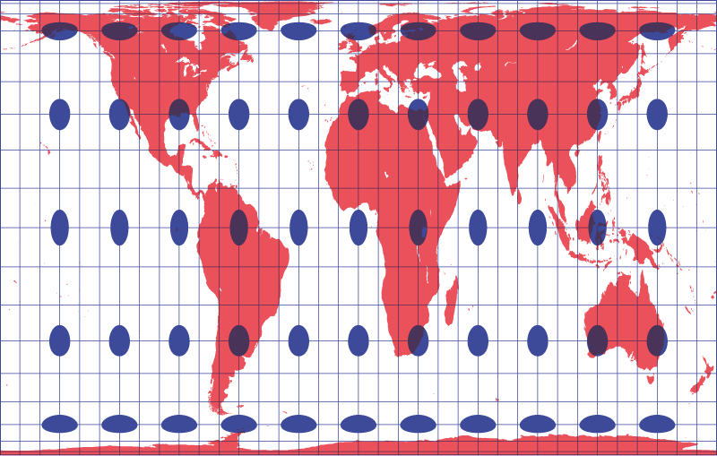
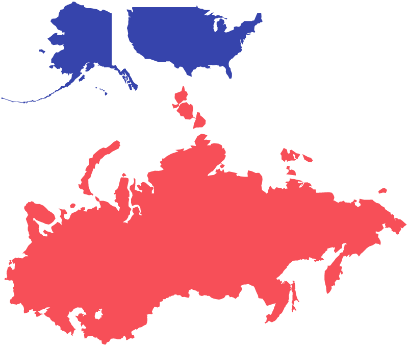
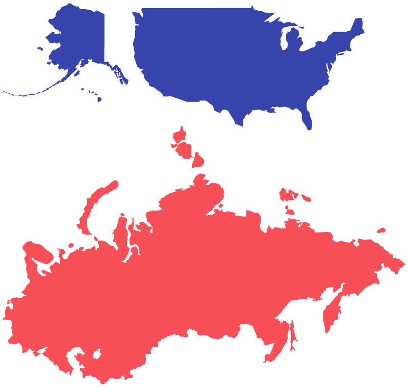
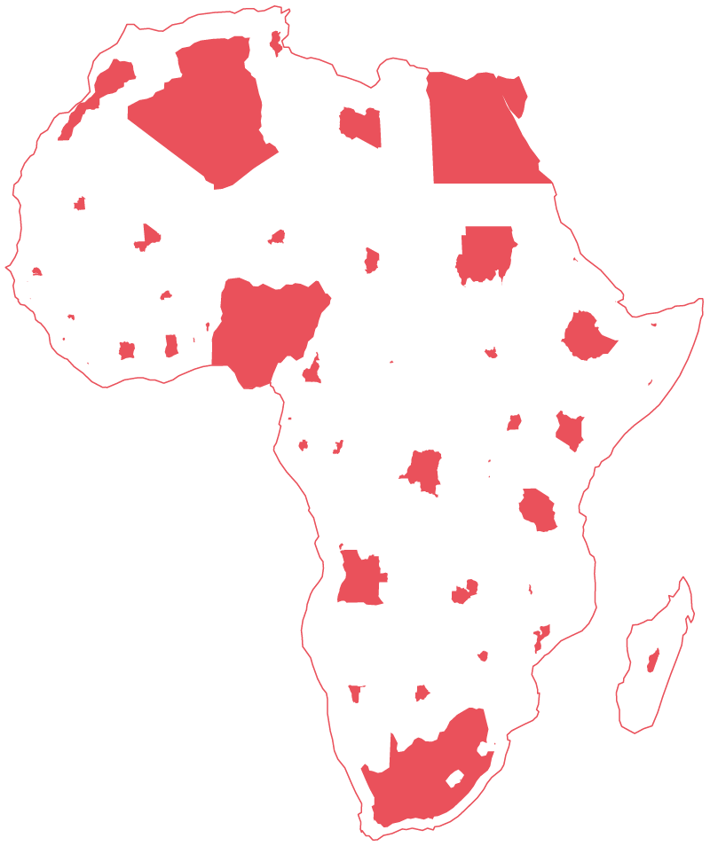
While our square maps distort physical geography, so does every map projection. No mapping system is perfect. The most commonly used map projection, Mercator, became popular because it represented any path with a constant bearing as a straight line. This was a boon to sailors in the 16th century, but it also skews geographic area heavily toward the northern hemisphere, creating the perception that the North America and Europe are larger than they actually are, relative to South America, Africa, and Australia.
Cartographers make choices about trade-offs like this every day in their work. We have made ours. As Mark Monmonier points out in How to Lie with Maps,
“A good map tells a multitude of little white lies; it suppresses truth to help the user see what needs to be seen. Reality is a three-dimensional, rich in detail, and far too factual to allow a complete yet uncluttered two-dimensional scale model. Indeed, a map that did not generalise would be useless. But the value of a map depends on how well its generalised geometry and generalised content reflect a chosen aspect of reality.”³
Before GPS was widely available and everyone had a supercomputer in their pocket, maps were made by hand on paper, and the creation of a new one was a major endeavour. Due in part to the amount of work involved, governments, corporations, or cartographers always brought a clear agenda to any map project. Modern technology makes map making is less arduous. It has lowered the stakes, and enabled us to play.
Recognition
We think it is important that residents can recognise their city in our maps. We did learn various ways we can modify the square map to alleviate distortions. We learned to work creatively with the arrangement of districts to align them appropriately. We also learned the value of creating “visual hooks” that evoke the city’s outline. A visual hook is a deviation from the standard square grid, based on some aspect of topography (a river, a bay, a coastline) that alters one or more map cells with the intention of making the map a bit more recognisable to the viewer. However, this “visual hook” sometimes eludes us. Acceptable square maps cannot be made for all cities (we conceded defeat with Mexico City and Barcelona, for example).
What counts as acceptable is difficult to define. We often say a map “feels right” or “feels wrong”. We say this because, beyond all the technical work, intuition is important. When designing a map like our square maps (which is to say, when working with obvious and extreme abstraction) it is important to keep in mind what these maps are for. They are simplifications that need to evoke a city at a glance. As such, a viewer needs to be able to at least guess the city’s identity with a fair degree of certainty. If the square map of a city is a total mystery, it is a failure, and we reject it.
Though we take our cue from established districts, it is worth noting that these divisions are not necessarily rational, good, or fair.⁴ Dividing urban space into administrative regions is often arbitrary—there is rarely anything intrinsic about how cities are parcelled out into administrative subregions. And each city does it differently. District boundaries might follow the topography of the city (roads, canals, rivers, etc.), or they might be overlaid as a geometric grid. The stability of district borders ranges from rigidly fixed (New York City’s districts have not changed since 1898) to wildly erratic (Montreal has changed its district layout three times since 2000). Additionally, what is considered part of a city can range from expansive (“Auckland” covers some 5000 km²) to restrictive (Copenhagen is only 88 km²). Despite this variation, each city does collect data at the level of these districts, and these are the units we must work with. And despite the variation, these areas are all typically small enough to be able to show how patterns change across the landscape of the city and large enough to be read quickly without a magnifying glass.
On cartograms
A cartogram is a kind of map that changes the size, and sometimes shape, of geographic areas (e.g. county, province, borough) based on some measured dimension such as population or GDP. In the Cities Squared project, we worked with administrative districts.
Cartograms can work in a number of ways. Some cartograms convert all map units into the same shape (our square maps work this way), whilst some retain the original shape but scale them up or down. Some retain the original shape of the units and scale them, but leave gaps in order to conjure the city’s outline. And some create crazy liquid-looking blob shapes that look like marble endpaper. None are perfect, and each option involves a trade-off. Some have a clearer relationship to standard geographic representation, some are easier to read as a set of quantities. The cartographer must decide which kind of map is best suited to telling their story.
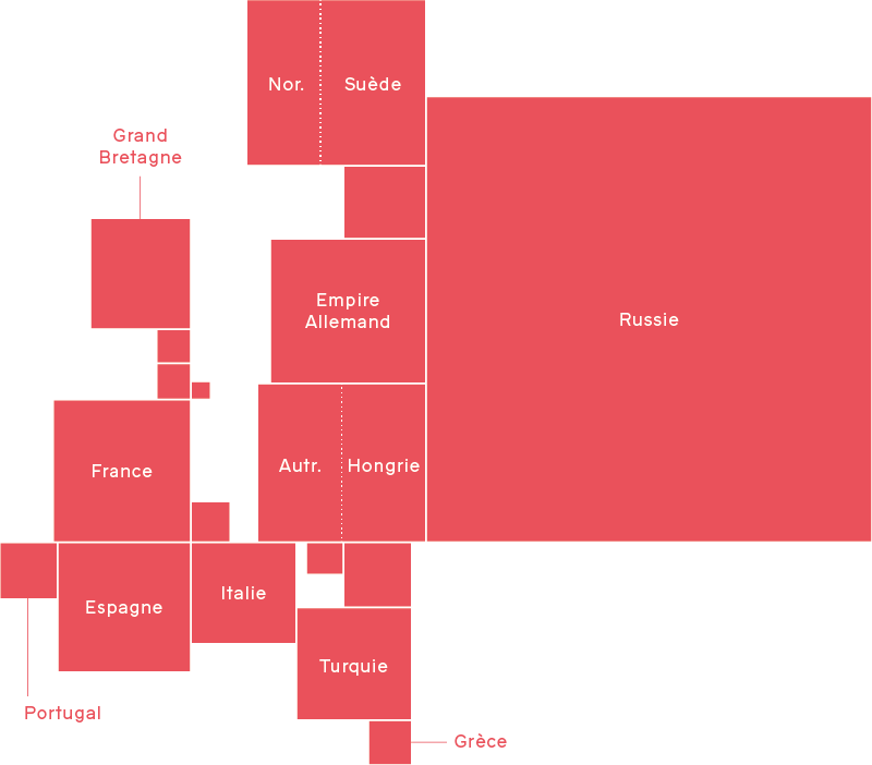
The earliest cartograms are often credited to Émile Levasseur, who used them to illustrate his economic geography text book of 1868. Levasseur arranged rectangles to form a morphologically recognisable map of Europe, and scaled and coloured these rectangles according to various schemes. The early 20th century saw a number of attempts at cartograms which retain the characteristic shapes of administrative areas whilst distorting their size, but it wasn’t until the adoption of computers in the latter half of that century that more complex cartograms became possible; notably through the work of Waldo Tobler, Judy M. Olsen, Danny Dorling, and most recently Gastner and Newman who developed “diffusion cartograms” (which, we feel, look cool but are not actually that useful).
Recently the popularity of cartograms of all types has blossomed, thanks in part to the efforts of graphics teams at news organisations putting more novel visualisation methods before the public, and in part to the ready availability of production technologies such as ggplot, D3js, and commercial offerings such as Tableau. You no longer need to be a computer scientist or a seasoned cartographer to produce high quality cartograms.
The data-driven city
Cities have long been a source of and place to use data, especially since the industrial revolution. Today many cities produce an astonishing amount of data in the course of daily operations. But numbers are not knowledge. Interpretation provides the leap from raw data to genuine insight. Sometimes data is under-interrogated—we have seen many city officials confuse large amounts of data with actual understanding of what is going on. Data can be made to serve various political agendas, since most datasets can be manipulated to tell a wide variety of stories depending on how they are organised and edited. We, too, tell stories with data in the maps in this book—though, we hope, in better faith. We aim to use maps to help people better understand quantitative data and statistics. But we are always mindful of how easy it is to abuse these tools to grossly misrepresent “the truth”. If data is an increasingly important way to “see” our environment, how do you display it in a way that is fair? What does that actually mean? Is that even possible?
We believe alternative forms of cartographic and data display help people make decisions better and faster. The strength of the square maps in this book lies in their simplification and abstraction of data, suggesting new perspectives and understanding for those who manage cities and city life. They are not the only way to show local data, but a new kind of tool for understanding what data is telling us about the world.
Cities Squared is available now on Amazon.
- A choropleth is a map that uses some colour, shade, or pattern to visualise some dimension (e.g. population size, birth rate, number of bakeries) on a zone-by-zone basis—by definition you can’t make a choropleth without cutting a map up into areas. Typically these areas are some official unit (e.g. a state, province, voting ward).
- See: https://tools.aftertheflood.com/londonsquared
- Mark Monmonier, How to Lie with Maps (second edition), University of Chicago Press, 1991/1996, p.25.
- Where district lines fall is decided by politicians who often have selfish goals. The drawing of voting districts in the US is a great example of how the process of creating administrative regions can be twisted toward political ends.