Displaying charts in text without having to use code
Data can be hard to grasp however visualising it can make comprehension faster. Sparklines (tiny charts in text, like this: 123{10,20,30,40,50,60,70,80,90,100}789) are a useful tool, but creating them for the web has always required code and using them in word documents was previously impossible.
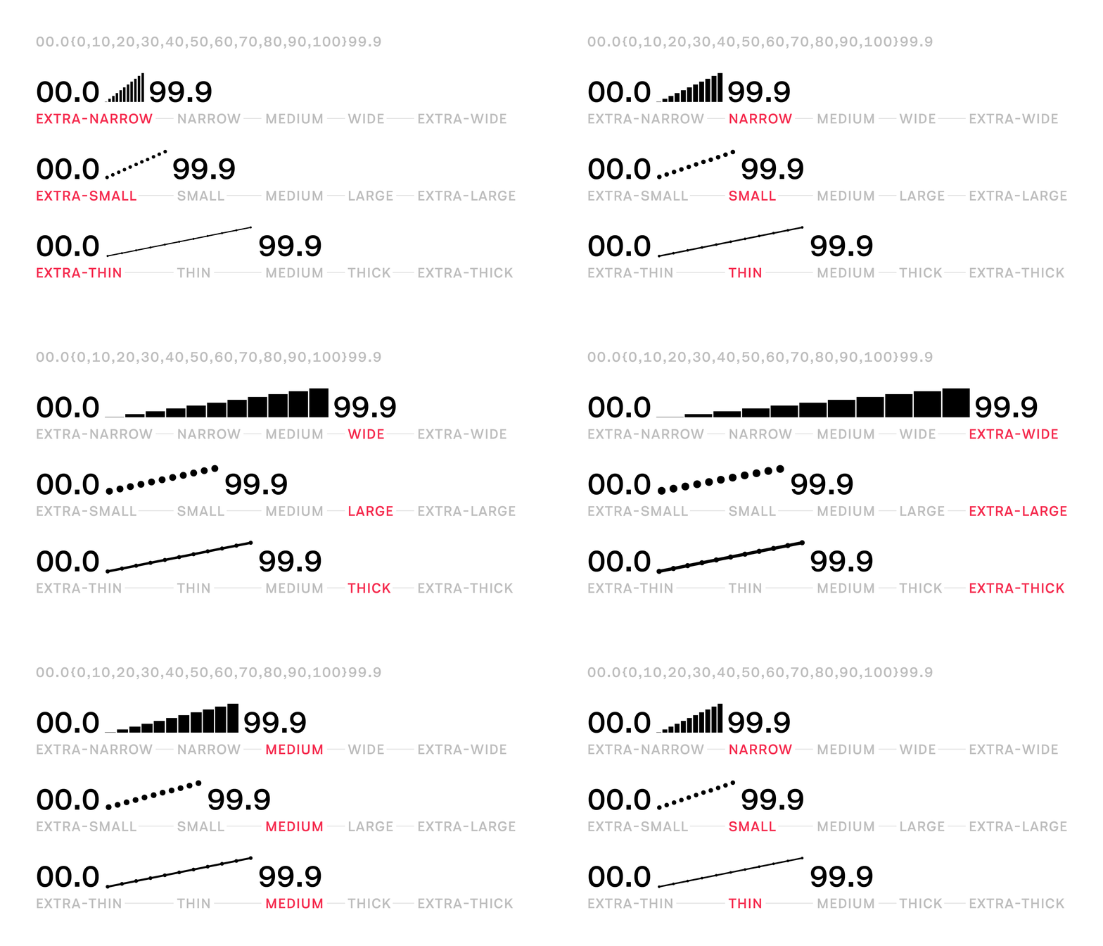
Sparks, now in its second release, is a family of 15 fonts (three variants in five weights each) that allows for the easy combination of text and visual data by removing the need for any technical know-how. By installing the Spark font you can use them immediately without the need for custom code.
*Sparklines were first conceptualised by Edward Tufte as a way of placing data evidence as close as possible to the idea(s) it supports.

How it works
To use Sparks all you need is a font file, some text, and an application that can make use of OpenType Contextual Alternates, e.g., a new-ish web browser, Microsoft Word, Adobe Illustrator.
Sparks data needs to be formatted as comma-separated values, with curly brackets at both ends of the set, e.g., {30,60,90}. You can also have numbers at the beginning and end of the set, which are useful for providing the start and end points, e.g., 123{30,60,90}456 – Sparks has numerals built in.
With your data in the correct format, all you need to do is change the font and voilà, our example of 123{30,60,90}456 becomes 123{30,60,90}456.

Get AtF Sparks on Github
We think that creative minds will find many more uses for Sparks and, like any technology, it is designed to be built upon and to get better through iteration. You can read about how the fonts work and see some examples on our tools page.
This page’s lead image redraws content from Edward Tufte’s Beautiful Evidence in Atf Spark. More on sparklines here.